What is the Responsive Web Design ?
| Source: | DataSource |
|---|---|
| Language: | English |
| Topic: | ToWeb |
| SubTopic: | Web Development |
| Last Edit By: | DochyJP |
| LastEdit: | 2021-04-14 |
| Document type: | Documentation |
| Status: | Active |
| Access: | free |
How a responsive website displays on PC and mobile ?
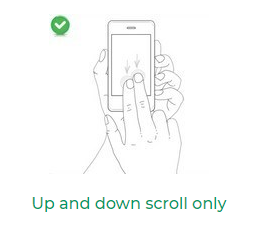
The image above shows how a website is typically displayed on a computer: the width of the screen allows to view the website without horizontal scrolling and the texts are large enough to be clearly legible. You just have to scroll vertically to see the page content.
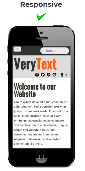
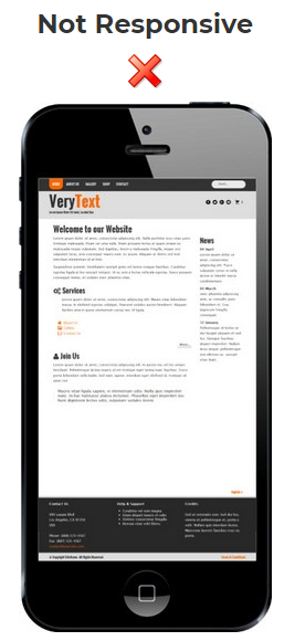
But on a mobile phone or tablet, the physical width of the screen decreases dramatically, and here is how the same site will be displayed on a smartphone depending on whether it is responsive or not:
Does the Retina screens are not the solution ?
No, they do not change the display problem of non responsive sites on mobile: it is the physical screen size that matters: a 2" wide screen will always be 2" wide whatever its resolution and pixel density. Texts too small to be read comfortably will have the same size on a screen with a pixel density of 300dpi or 150dpi.
Why do I need a mobile friendly website ?
The rise of smartphones means that more and more people are going online from a mobile device, but here are some numbers:
- Since 2017, more than half of the world's population now use a smartphone and more than half of the global internet traffic is now from mobile phones. Check this more precisely for your country with the Consumer Barometer with Google.
In 2018, global Internet traffic via computers was accounted for only 46%, against 54% for mobile devices. For 2021, mobiles are expected to reach 61% of global Internet traffic.
- Thanks to mobility of smartphones, users search more and more frequently and immediately on the Internet for information and sites as soon as they need them, they compare prices and services, they easily spread their information to their contacts, etc.

Why not create a mobile website in addition to my current website ?
It was the only option before the responsive approach, but the disadvantages of this method makes the obsolete today:
- two websites ... twice more work: you have to report on the mobile site any change made to the computer website, and vice versa. For a website updated regularly as an e-commerce website that is very difficult and may cause many errors. By creating a single responsive website you save time and money and you are sure that your content is always up to date for all devices.
- search engine optimization: with separate websites, your content site will be partially or completely duplicated on several sites with different URLs, which is a very bad SEO practice ("duplicate content" penalty). And your backlinks and keywords will be diluted in 2 locations. It is very difficult to overcome these SEO pitfalls.
- creating separate sites for mobile and PC is not the option chosen by the major brands: responsive approach is used by Microsoft on its website and it is one that is recommended by Google to webmasters:
When building a website that targets smartphones, Google supports three different configurations:
- Sites that use responsive web design, i.e. sites that serve all devices on the same set of URLs, with each URL serving the same HTML to all devices and using just CSS to change how the page is rendered on the device. This is Google’s recommended configuration.
- Sites that dynamically serve all devices on the same set of URLs, but each URL serves different HTML (and CSS) depending on whether the user agent is a desktop or a mobile device.
- Sites that have a separate mobile and desktop site.
How to test if my website is responsive ?
There are several simple ways to test the behavior of your website on mobile phones or tablets:
- Open your website on a smartphone or tablet browser: if the site is displayed in the same way on your PC but smaller because the browser has zoom it out to fit the screen width, it is likely that the site is not responsive.
- Open your website in your favorite browser but reduce the width of the window: if an horizontal scrollbar appear the website is not responsive. Do the same test on our website in your browser and watch how the site adapts its layout when decreasing the width.


